Material : pencil, paper
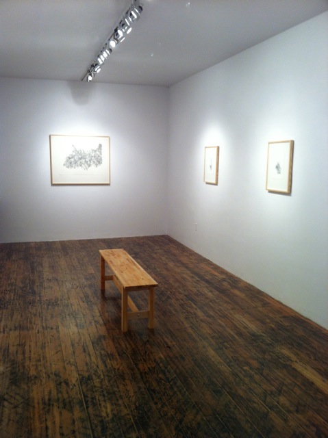
Location : CSA Vancouver BC, 2012
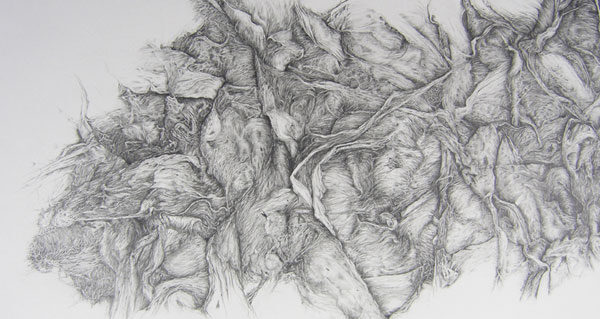
Description: The project includes large (22” x 30”) and small (8” x 11”) drawing details of Pink Fiberglass insulation that incorporate turn-of-the-century (19th/20th) formal illustration, hard-rock culture and labour.
On August 6th 2009 I had a hernia operation on the left side of my lower stomach that left me unable to work. It was during this time that I attempted studies for this project. The proposed title, twenty eight days is a reference to the number of workdays the British Columbia Worker Compensation Board will cover for loss of wages due to a hernia operation. I was unable to move due to my operation. When able, I worked on the drawings in my apartment. Latter, the drawing were completed in the studio (2009-2011).
Detail Description :
Inspiration for twenty eight days came from atypical doodles I produced in homage to and for album covers and tattoos in my teens and early twenties. These largely intuitive drawings were and still are very prevalent in punk, death-metal and hard-core sub-cultures today. It also became clear that labour itself was a considerable component to the project. In other words, the discipline of sustained observation over time required for the project mirrors repetitive labour.
Bite and burn (2006-09), a multi-part project, provided the impetus for focusing on Pink Fibreglass insulation. During the bite and burn project Pink Fibreglass was used, which is employed primarily as a residential construction material to insulate and soundproof homes. Pink Fibreglass was similarly used in the bite and burn project, predominantly for its sound proofing qualities, yet became an integral material in the construction of a room that ‘housed’ the primary component for the project. Pink Fiberglass was also chosen for it’s flesh-like colour and visual texture, which is evocative of exposed muscle tissue.
I subsequently relied on the aesthetic qualities of the Pink Fiberglass insulation for producing both the sculpture horde and the performance-based work entitled armouring, both components of bite and burn; encore. Using a close-up image of the insulation I relied on its resemblance to exposed ‘muscle’ tissue to create the design for the long-sleeve shirts that make up the visual component of horde. This design was intended to adhere to and faithfully reproduce the cultural aesthetic typical of death-metal tour-shirts produced in the 1980s and early ‘90s. In these works I was investigating the rituals, energies, sexuality, objects and aesthetics of the sub-culture of death-metal, punk and hard-core set within the context of contemporary art practices. It was at this point that I became interested in exploring directly the aesthetic similarities of the patterns within the Pink Fiberglass insulation to that of muscle tissue.


